Blog Category: ColorForm


Color Harmony Book

By Erika Goering,

Here’s my book for my Color/Form class. After all the photos I had to shoot and re-shoot, I’m glad it’s done. (Seriously… Over 1000 photos to get 8 good ones.) Overall, my hard work was worth it.
I’m pretty happy with how it turned out.


<

  Filed under: ColorForm, KCAI
  Comments: Comments Off on Color Harmony Book


Pantone vs. CMYK

By Erika Goering,

Converting between colors is tricky. RGB and CMYK never quite match up, and Pantone is a whole different concept. At least CMYK does get close to Pantone. That’s because they’re both subtractive color. Converting from subtractive color to another kind of subtractive color is easier than trying to flip between additive and subtractive. If I was using an RGB file, this would’ve bee much worse.

  Filed under: ColorForm, KCAI
  Comments: Comments Off on Pantone vs. CMYK


Color Star: Now With Pantone!

By Erika Goering,

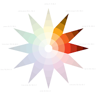
Here’s my color star with the addition of Pantone colors. I’m starting to get the hang of this Pantone thing. The number system is starting to make sense.

  Filed under: ColorForm, KCAI
  Comments: Comments Off on Color Star: Now With Pantone!


2 Minute Drill: Color & Emotion

By Erika Goering,

Here’s what I think of these colors:

Red 186:
  • Passion
    • fire
    • love
  • Fruit punch
    • happiness
    • nostalgia

Orange 1585:
  • spicy
  • energetic

Yellow 116:
  • Happy
  • Sunny
  • Playful

Brown-Green: 438
  • adventurous
    • grassy
    • dirty
    • muddy
    • fun

Blue 2747:
  • smooth
  • calm
  • watery
    • fluid

Chartreuse 584:
  • party
    • playful
    • fun

Violet 267:
  • authority
  • royalty

Gray 425:
  • gloomy
  • cloudy
  • bland
  • boring
  • sad

White:
  • clean
  • sterile

Black:

  • sophisticated
  • daring
  • bold

  Filed under: ColorForm, KCAI
  Comments: Comments Off on 2 Minute Drill: Color & Emotion


Color & Emotion

By Erika Goering,

This project was pretty fun. I always wanted to name colors. In fact, I’ve done this kind of thing before in the past. On ColourLovers.com, I created a few palettes relating to my life (mostly food, really…), and I chose colors that had names that were relevant to my themes. (Because it’s fun, that’s why.)

Here’s my best ones:

Colors inspired by my neapolitan birthday cake from a couple years ago. All the colors have flavor names. (Vanilla cream, vanilla slice, strawberries & cream, chocolate cake, and chocolate tombstone.)

Coffee colors and flavor names. Because coffee keeps me alive. Yes, I have an addiction problem. So what?

Anyway, I love merging verbal language and color. They go together like a form of hybrid poetry. Illustrative color names add a layer of meaning that accentuates the meaning of the color itself.

  Filed under: ColorForm, KCAI
  Comments: Comments Off on Color & Emotion


Saul Bass and the other guys

By Erika Goering,

Saul Bass was a ninja.
He designed a lot of logos that are still in use today, in their original form or slightly updated. And that says a lot about his genius. If you do something right the first time, there’s no way to improve it; only tweak it for the changing times.

Bass (1920-1996) lived a life of creation. He was a prominent designer who made logos, film posters, and more. His work changed the way the world looked at commercial art. Bass used angled lines and unusual typography in his work. People don’t realize that when they think of 1960’s logo design, they’re thinking of Saul Bass.

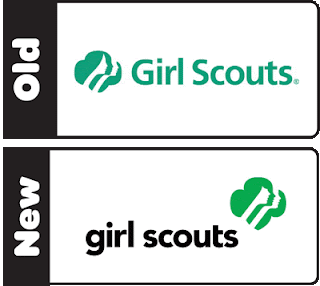
There’s an unwritten rule in the design world that you don’t mess with a Saul Bass logo. That’s why when designers are hired to redesign one of his creations, they hesitate. So when OCD (Original Champions of Design) were hired to update the Girl Scouts logo, they made very small updates to maintain the integrity of the original masterpiece.

The current Girl Scouts logo combines the badge-like shape of past logos with profiles of young girls looking toward the future. The shift in negative and positive space shows the individuality of each of the girls. None of that ever changed. The changes the OCD made were subtle, but meaningful. The girls are more youthful, and the image is stronger, possibly to signify the change in society since the original, dainty logo’s time. (The original was designed in 1978.)

Since I mentioned Saul Bass, I have to mention the Original Champions of Design. (After all, I used their version of the logo for my project.) They seem relatively new to the design world. Their portfolio is very typographical in nature, and their work is very clean and straightforward. I personally hope they don’t fall victim to some of the trendy crap that rolls around every now and then.

Overall, I think OCD did a good job with Saul Bass’s logo. The united, feminine feeling is the same, only stronger and younger. This is one case in which messing around with a Saul Bass logo went pretty well.

Sources:
http://www.underconsideration.com/brandnew/archives/this_is_not_your_moms_girl_scouts.php
http://www.gswise.org/About-Us/News/Whats-New.aspx
http://saulbass.tv/
http://originalchampionsofdesign.com/index.php

  Filed under: ColorForm, KCAI
  Comments: Comments Off on Saul Bass and the other guys


Color Harmonies

By Erika Goering,

I’ve known a bit about color since I was very, very young. My dad, who is an artist, taught me about really basic color theory (primaries, secondaries, and compliments) when I was a small child.
So I’ve always had a pretty good grasp on the concept of color relationships.

I’ve been taught basic color harmonies over and over since grade school, so it’s all review for me so far. Although, I could always use some more practice with it.

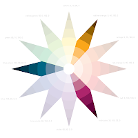
Speaking of practice, here’s my color star (a la Itten):

Pretty nifty, huh?

Here are some different color relationships I can show through this model:

Complimentary (polar opposites on the diagram create a sense of balance and equality)
Split-Complimentary (one color and the colors on either side of its compliment
create a balance without such a direct contrast)
Triadic (three evenly-spaced colors show a varied palette)
Square (four evenly-spaced colors that show two colors with their respective compliments;
a diverse set of colors showing a broad spectrum)
Rectangle (also two colors with their compliments, but not evenly spaced on the diagram;
a more sophisticated, unpredictable harmony than the square)
Analogous (colors next to each other; subtle changes in hue are less dramatic than other harmonies)

I’ll leave you with this tender morsel of wisdom:
Don’t use contrasting colors for text!!
Feel that headache? Yeah. Think of me every time you think that’s a good idea.

  Filed under: ColorForm, KCAI
  Comments: Comments Off on Color Harmonies


Anyone Else Suddenly Craving Thin Mints?

By Erika Goering,

One of my favorite design blogs is BrandNew. Basically, its purpose is to show recent logo redesigns/tweaks.
I find it very interesting because I love to see what people do to update and modernize pre-existing logos.


Lately, my favorite revised logo is the Girl Scouts logo. That’s why I was so eager to use it for my Color/Form class logo project.

The revision was more of an update than a full-on redesign. The silhouettes are all still there, but the hairstyle of the first girl is more contemporary and the girls have all received facelifts (more perky lips and noses) to make them look younger. The trefoil now comes down to a point at the bottom (a throwback to the first few Girl Scouts logos).


Given the choice between the two above versions of this logo, I chose the new one.


I think this was a good exercise to get me familiar with Adobe CS5. There are some things that have been moved around since CS4, so this kind of activity helps get me reacquainted with the Creative Suite.

Top: Trace with pen tool


Center: Live trace
(not too bad for default settings)


Bottom: Live trace with some manual tweaks
(I corrected some weirdness in the facial features.)


Saul Bass was the mastermind behind the original design. It’s an unwritten rule that you just don’t mess with a Saul Bass logo. He was the pimp of logo design, and we are his hoes. That’s just how it is. Deal with it.


So, when word got out that OCD did some tweaks, some people were offended at the abomination that had been committed.
But I like the new look. They’re younger girls with a bit of attitude. They look more current (albeit a bit trendy), and they capture the spirit of today’s girl scouts.


…Man, I want some cookies.

  Filed under: ColorForm, KCAI
  Comments: Comments Off on Anyone Else Suddenly Craving Thin Mints?