Color Harmonies
By Erika Goering,
Filed under: ColorForm, KCAI
Comments: Comments Off on Color Harmonies
I’ve known a bit about color since I was very, very young. My dad, who is an artist, taught me about really basic color theory (primaries, secondaries, and compliments) when I was a small child.
So I’ve always had a pretty good grasp on the concept of color relationships.
I’ve been taught basic color harmonies over and over since grade school, so it’s all review for me so far. Although, I could always use some more practice with it.
Speaking of practice, here’s my color star (a la Itten):

Here are some different color relationships I can show through this model:
 |
| Complimentary (polar opposites on the diagram create a sense of balance and equality) |
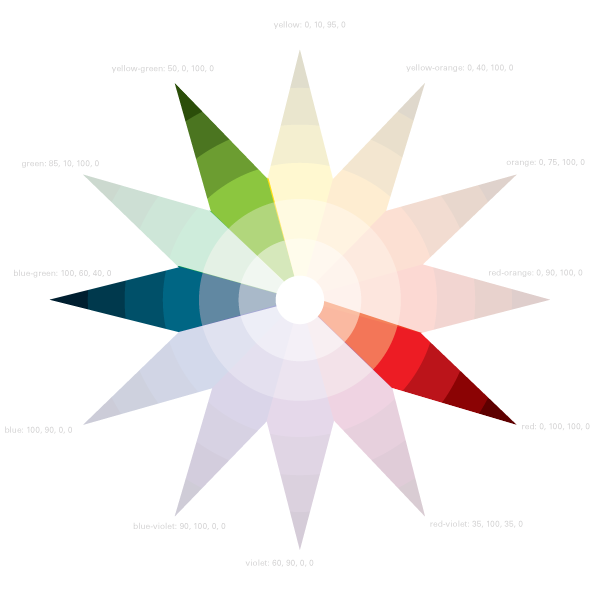 |
| Split-Complimentary (one color and the colors on either side of its compliment create a balance without such a direct contrast) |
 |
| Triadic (three evenly-spaced colors show a varied palette) |
 |
| Square (four evenly-spaced colors that show two colors with their respective compliments; a diverse set of colors showing a broad spectrum) |
 |
| Rectangle (also two colors with their compliments, but not evenly spaced on the diagram; a more sophisticated, unpredictable harmony than the square) |
 |
| Analogous (colors next to each other; subtle changes in hue are less dramatic than other harmonies) |
I’ll leave you with this tender morsel of wisdom:
Don’t use contrasting colors for text!!
Feel that headache? Yeah. Think of me every time you think that’s a good idea.