7 Type Explorations
By Erika Goering,
Filed under: KCAI, Typography2
Comments: 1
If there’s one thing I like about letterforms, it’s their inherent sexiness. So many lovely shapes and personalities in letterforms. I loves me some letters, yo.
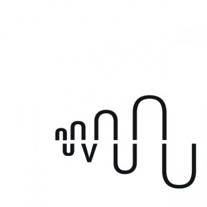
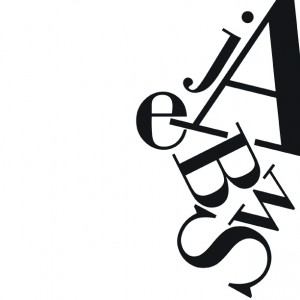
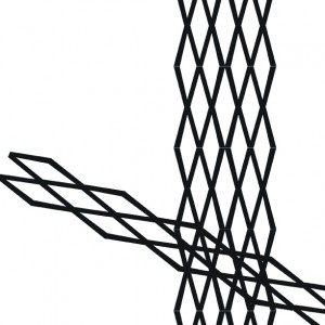
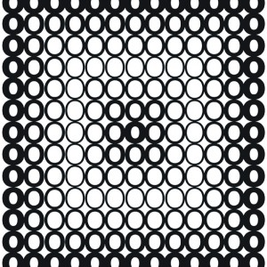
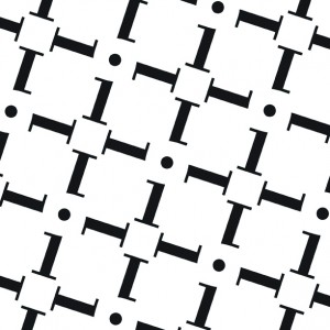
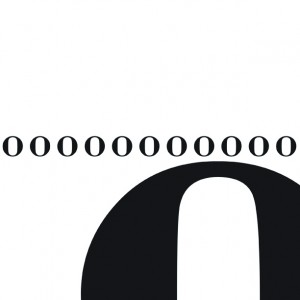
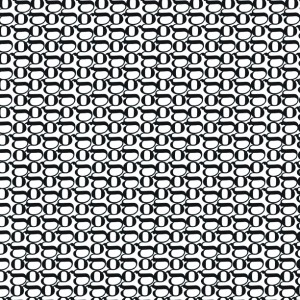
So this exploration of experimental typography was a lot of fun. I got to step away from actual words and just focus on these beautiful shapes in relation to other beautiful shapes.
Marty
February 3, 2011 at 4:53 pm
1)good
2)where is concentration? beyond the entire right side of the composition?
3)nice, but extend fully off frame on left
4)nice, but go full frame on all sides. too close now and looks like an oversight
5)good
6)need an in-between size and need to engage top of composition.
7)good, but a bit static. some variation would be nice.