Site Outlines & Descriptions
By Erika Goering,
Filed under: KCAI, Online Presence for the Artist
Comments: 2
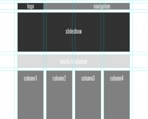
- Logo is in a traditional, expected location.
- Slideshow showcases previous clients and work. It rotates through images automatically, but there are controls for going forward/backward in the queue.
- Blurb has a little bit of basic info about the artist/company, while being visually attractive yet out of the way.
- Four columns of content; each with equal dominance.
- Navigation is linear and eye-catching (so the user knows where to go), but unobtrusive as to not interfere with the overall composition.
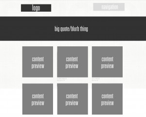
- Logo in the usual place.
- Big quote area gives a very quick description of who they (the company) are.
- 3-column grid has squares for content/project previews. Clicking on one of these takes the user to the project’s page.
- Navigation is very small, light, and quiet, so the user is drawn towards other elements. However, once the user scrolls down, a new, more bold navigation bar sticks to the top of the browser window.
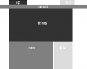
- Logo in the usual place.
- Search bar is a tertiary element, where attention is given only when it is needed.
- Big image gives a feel for the company’s goals and audience.
- Large content area is for large blocks of body text.
- Sidebar has secondary content that supplements or complements primary content.
Here’s the key to all my shades of gray and their meaning as far as hierarchy goes:


Mel
September 19, 2011 at 8:48 pm
Nice work. Which sites are they?
Erika Goering
September 19, 2011 at 10:51 pm
1. Either Cutler or Doejo (they’re both so similarly structured, it’s kind of a mixture of both)
2. Electric Pulp
3. Alpine Meadows