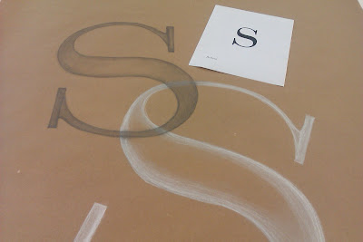
Sexy Serif S
By Erika Goering,
Filed under: KCAI, Typography1
Comments: 1
It shall be known that my least favorite letter to draw is S. In fact, before this project, I actually loathed it. (Except, of course, when it was this one. Yeah, you remember that thing. Pure awesomeness.)
Anyway, drawing a real S has always been pretty difficult for me. I could almost never get it to look right. Too many curvy parts to screw up. And I usually did, indeed, screw it up. So, when I was assigned a bunch of them to draw in my typography class, I was not a happy camper. But, then again, where’s the fun in getting everything you want?
So I played along and doodled some practice S’s in my sketchbook. Time after time, they got better, and I got happier.
I learned how to break down a letter into its anatomical parts and focus on those by themselves instead of the whole thing all at once. I usually started with a couple of ovals, then moved on from there, saving the spine of the S (that structure in the middle, where the main shape comes from) for last. (It’s the hardest part, I swear.)
I think it worked out pretty well.
As I drew more and more S’s, I really grew to appreciate all those sexy little curves. In fact, think I’m in love.
My favorite typeface of the bunch was Clarendon. (I have a weakness for slab serifs, don’tcha know?)

There it is. Just look at those big, thick, confident slabs where dainty little serifs would be on any lesser typeface… It’s simply delicious.
Slab serif typefaces don’t hold anything back. Those serifs are angular and strong. They don’t usually connect to their letters with little curvy bits; they just climb right on and set up shop.
One thing you should know about me: I have an unhealthy relationship with typefaces. But we make it work.

Marty Maxwell Lane
August 30, 2010 at 6:50 pm
Erika,
I enjoy how you described the characteristics of the letterforms in an emotional way. Your language really describes the nuances of the letterforms.
Marty