Refined Posters
By Erika Goering,
Filed under: KCAI, Typography2
Comments: Comments Off on Refined Posters
Last time, I had some trouble with holding onto my concept. This time, I brought it back!
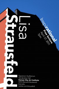
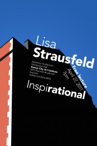
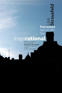
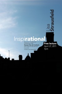
The two vector posters come back to my concept because they allude to Strausfeld’s love of simplicity. Her name on the left one acts as a backbone to the building, which speaks to her structured way of designing.
The left one is my favorite. I’m moving forward with that one, but integrating some aspects of the one on the right, like the placement of the building in the frame.
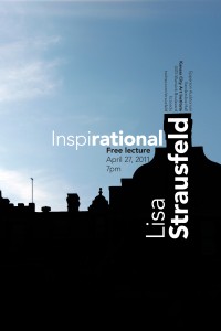
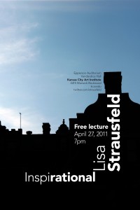
The one above is an attempt at an infographic kind of idea. While it’s not the most successful of these posters, I do like the introduction of the red type (using the brick color from the vectors). That will probably carry over to my next round of posters.
These all come back to the idea of simplicity and recognizable/identifiable shapes. Strausfeld is great at keeping things simple and accessible, so I tried to work with that in mind. I like the idea that the text can become an extension of the building, activating the space around it and integrating the type and image to create the illusion of one form (or at least multiple unified forms).
Admittedly, I am a bit bummed that I don’t get to use my more iconic view of Vanderslice. I really like that photo. Maybe it’ll be useful in another project. Oh well.
Sidenote: I love how my work has progressed throughout this project so far. Looking at my first poster ideas, I definitely see how there was potential for improvement. I’m very happy to see that I’m starting to utilize that potential and improve upon my work. Yay, growth!
