Magazine Layout
By Erika Goering,
Filed under: KCAI, Typography2
Comments: Comments Off on Magazine Layout
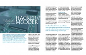
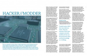
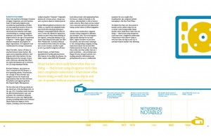
The opening spreads were pretty fun to do. So I made a bunch. I ended up using the last one (with some modifications, of course) for my article.
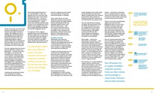
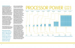
My article spreads:
That last page has a disproportionate amount of whitespace. Maybe it needs more text. Maybe the whole document needs more whitespace… I’ll move things around to make it all happy.
And I think I need to use either more or less photography in my layout. Right now, the opener feels so disconnected from the rest of the article. Adding more photos throughout (or taking the opening photo out and replacing it with some of my vector stuff) would unify the spreads (and possibly help with the whitespace issue).
I’m trying to stick to certain rules about my design. I’m a bit looser with my magazine rules than I was with the rules for building my icons, but there are rules there. For example, I can’t put any text in the lower row of modular space (AH! There’s a pullquote down there! Gotta fix that!) because that’s where my ethernet cable is. And there must be at least one pullquote for each spread. I’m still playing around with the pullquote color, though. Right now, the rule for pullquote color is that it must be the opposite color of whatever colored thing it’s closest to. (Kind of a sloppy rule, perhaps… but I’m working on it.)
