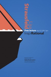
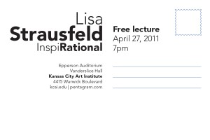
Final Poster & Postcard
By Erika Goering,
Filed under: KCAI, Typography2
Comments: Comments Off on Final Poster & Postcard
I realize my secondary information on my poster could be treated a bit better. As some of my classmates pointed out in critique, I could separate the lines of information so that some of it would align with the next little block of white in the middle of the page. Grounding my secondary text would fix the whole “floaty” feeling it has. It’s just kinda hovering there. It needs to be tied to something.
A designer’s work is never done!


