Blog Category: VisCom2


Infographics Skeletons

By Erika Goering,

Finally putting information with my pictograms.

I had a pretty good idea of what my pictograms could represent, so I didn’t have too much trouble putting them into context with the information/data that I have.

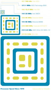
This is the framework I’ve got so far for my infographics. Ta-da!

Issues: Smaller CPUs are too dang tiny. So I’m either going to do a call-out, zoom-in type of thing that makes them easier to see, or I’ll simplify my icons even more (only at the smaller sizes) so they’re easier to read when they’re super-small.

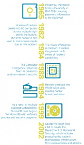
The timeline’s dates should be spaced out in proportion to the timespan that they represent. For example, all the 1980s dates will be closer to each other than to 1965. Also, I’ll be using the timeline’s “spine” differently, whether that be a solid line or something else. I’ll play around with it and see what works the best.


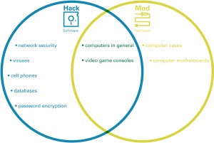
My Venn diagram needs the labeling outside of the circles. And a suggestion from my critique partner was to use the shapes in the icons themselves as the frame for the diagram. Ooh! Fancy!

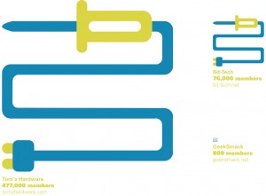
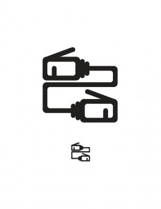
The ethernet idea is solid, but the information is so low-contrast in comparison with the white background… I need to make it darker. And the ethernet plug should be smaller. As close to actual size as possible. Boo-yah! And same thing with spacing out the dates according to relation to each other in time. Gonna fix that too.

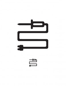
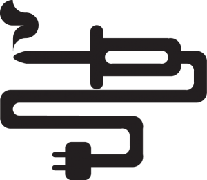
Soldering iron cords should grow longer (instead of whole icon growing larger) to reflect the number of members in each online community. Shorter cord = fewer members. Yep. Simple as that.

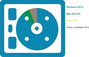
Hard drive pie chart has some problems. First of all, my data is referring to the overall usage share among average people. It should reference the l33t crowd specifically, which would have a much higher number of Linux users (and make for a nicer-looking graph!). So, the first thing would be to find a good statistic for hacker/modder operating systems. Yeah, Windows will still prevail (as lots of hacker-types are also PC gamers), but I want the information to be more relevant to my specific culture. (Hackers love their Linux, don’tcha know?)

As for the color in the pie chart, that will definitely change. This rough “skeleton” of visual data is admittedly sloppy. I didn’t have time to cut out each little piece of negative space, so I just set the blending mode to “overlay” or something similar, and that changed the color from what I had in mind. It will be fixed soon. Although, the overall color (especially the green) will change a bit, anyway. So none of this is set in stone at the moment.

Next step is to pick the ones that work well at communicating, and explore those options like crazy.

Wish me luck!

  Filed under: KCAI, VisCom2
  Comments: Comments Off on Infographics Skeletons

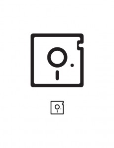
Linear Process: Floppy Disk Pictogram

By Erika Goering,

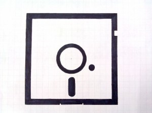
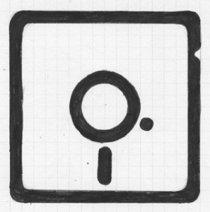
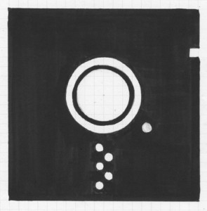
From rough scratchy charcoal sketch to sharpie iterations to refined color vector:
  Filed under: KCAI, VisCom2
  Comments: Comments Off on Linear Process: Floppy Disk Pictogram


Pictograms & Colors

By Erika Goering,

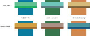
My color schemes are based on objects from my book. I’ve got hard drive blue, circuit board green, and ethernet wire orange as my starting points, then I gave them accent colors that are analogous or complementary.


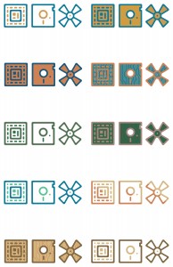
And here are those colors applied to my icons:

  Filed under: KCAI, VisCom2
  Comments: Comments Off on Pictograms & Colors


Pictograms Again!

By Erika Goering,

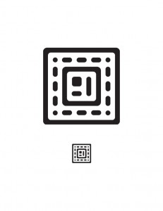
The latest & greatest:

  Filed under: KCAI, VisCom2
  Comments: Comments Off on Pictograms Again!


Digital Pictograms

By Erika Goering,

Here are my latest revisions. They’re digital now! No more Sharpie fumes! (Aww, man…)

I went ahead and digitized all of them (instead of just the required 2/3) because I wanted to get feedback on every single one before I move forward. I feel better about their future that way.


All of them in a neat little row together:


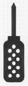
My rules: There are no sharp angles, except where absolutely necessary (like where the screwdriver bit meets the body, or where the soldering iron outlet prongs attach, where rounded angles wouldn’t be appropriate). I also keep a very specific set of units to build from.

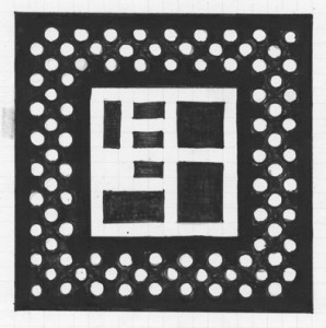
These are all of the shapes I used. I didn’t use the pen tool at all, because my shapes are so geometric. I wanted them to be mathematically perfect, so I used geometric shapes and put them together. (And I “pathfinder’d” all the rounded negative space away.)

From left to right, going down, they are:

Corner-rounding piece (for thick outline only) | negative space corner rounder (for the inside corners of the outlines. This shape is never seen as positive space. Ever.)

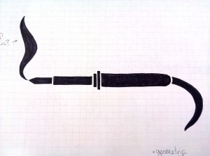
Round unit (for single dots and rounding line ends) | quarter circle (used only for the soldering iron smoke)

Square unit (the width and height of one unit. This piece makes up all the main outlines. I used this the most, obviously.) | Triangle tip (for soldering iron and screwdriver tips)


…And that’s about it. I’ll be working on the inevitable revisions soon. But so far, so good. Hooray!
  Filed under: KCAI, VisCom2
  Comments: Comments Off on Digital Pictograms

Pictogram Revisions

By Erika Goering,

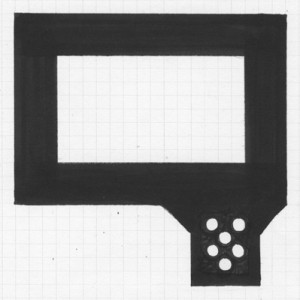
Here are the 12 I’m thinking about using. (I had 13, but that little guy got killed off pretty early. Poor guy…)

Grid with dot pattern:

Grid, curvilinear:

We’ve decided to move forward with the curvilinear one with a few tweaks. Everything will be more squared so each icon will take up the same amount of vertical and horizontal space.

  Filed under: KCAI, VisCom2
  Comments: Comments Off on Pictogram Revisions


Pictogram Process

By Erika Goering,

My previous round of pictogram sketches were varied and diverse. This was necessary to establish a successful direction and move forward with it.

Here’s those guys:

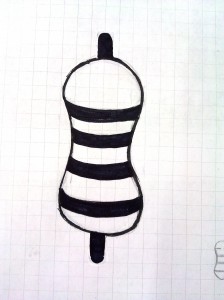
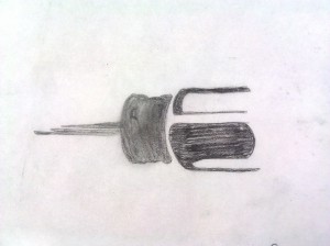
Resistors: organic and curvilinear

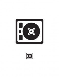
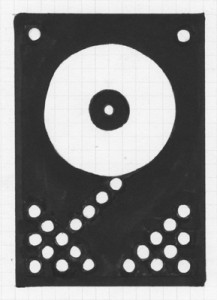
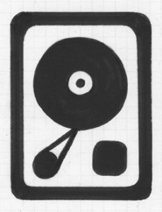
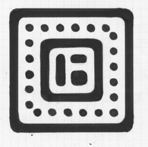
Hard drive: based on a grid, mixture of curvilinear (disk platter, screws) and rectilinear (case and read head thingy)

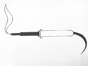
Soldering irons: partial fill and fragmented
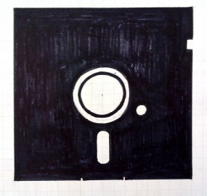
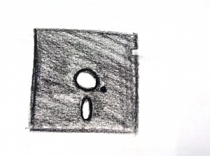
floppy disks: sketchy and grid (playing with positive and negative space.

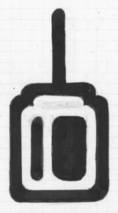
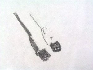
ethernet cables and screwdriver: complex figure/ground

  Filed under: KCAI, VisCom2
  Comments: Comments Off on Pictogram Process


R&R: Pictograms

By Erika Goering,

Pictograms are supposed to be simple forms that give the viewer a sense of understanding. The pictogram directly represents an object, action, or emotion. The way the image is presented (with framing, positive/negative space, and composition) should give viewers all the information they need to come to a conclusion about the graphic. Does the image make them feel happy? Determined? Hopeless?

A good pictogram can make a person understand, with absolute clarity, a complete concept. A bad pictogram will leave the viewer confused and/or unaffected.

The water icons above are bad pictograms, because they rely too much on color to illustrate heat, and cliche symbols to represent hot and cold, which leads to a humorous conclusion by the viewer.

The Olympic pictograms have changed over the years, but they’ve always tried to be simple, cohesive shapes that transcend natural language. (The whole point of a pictogram is that there’s nothing to read; it’s universal for everyone.) The most successful Olympic pictograms have been the ones that have functional clarity and pleasing shapes. We, as viewers, can determine what the pictograms mean, and relate to their human forms. The less successful Olympic pictograms have vague meaning and overly-abstracted/overly-stylized human forms.

Good. Dynamic and illustrative without being complex. There’s a good sense of motion here without needing “motion lines” or anything ornamental. Simplified to its essential parts.

  Filed under: KCAI, Read&Respond, VisCom2
  Comments: Comments Off on R&R: Pictograms


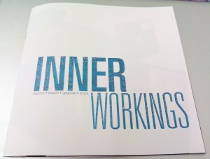
Final book: Inner Workings

By Erika Goering,

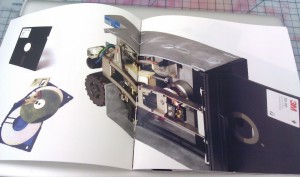
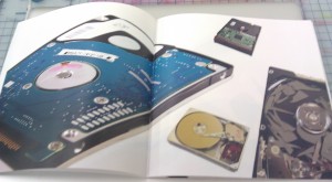
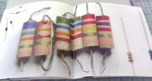
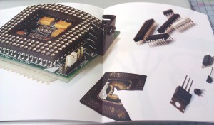
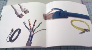
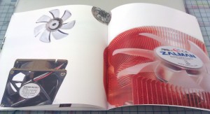
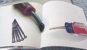
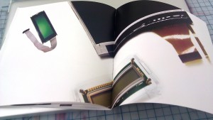
I originally started with “hacker,” but because it’s hard to photograph software (as it’s all abstract, virtual information or, more physically, a bunch of disks), I ended up going for the hardware version for more variety in images: a hardware modder. Hardware modders believe in the same things software hackers do: to find and exploit vulnerabilities or insufficiencies in technology and take advantage of them in order to make them more useful. The most common hardware modders will perform a simple upgrade, such as adding more RAM to a computer or cleaning a fan, or taking apart a computer to repair or replace a broken part. And that’s why I show broken parts in my book. More hardcore modders might change the shape of a computer or device or add extra parts and functionality just for fun. This can be done with things like modchips. Because of the nature of their modifications, hardware modders are very familiar with tools such as screwdrivers and soldering irons. Hardware modders are also experienced with the inner workings of electronics, and they sometimes build devices from scratch, with circuit boards, displays, and other necessary hardware. Experienced hardware modders sometimes share their work with the hacker/modder communities on the internet, to both show off their skills and to suggest that other people try what they did.

  Filed under: KCAI, VisCom2
  Comments: Comments Off on Final book: Inner Workings


Gathering Artifacts: R&R

By Erika Goering,

Response to How Does the Smithsonian Collect Artifacts?

An artifact is meant to be like a time machine. It can transport you to a place and time where the object would be experienced. An artifact gives you insight to the type of people who might use the object. So, an artifact is not just the object itself, but how it was used and who used it. A good artifact should provide a full sense of history. A sense of environment.

That is what I’m trying to do with my hardware modder book, Inner Workings. It shows hardware and tools that such a person would use. It also showcases broken and disassembled hardware to evoke the sense of curiosity that hardware modders have toward technology.

  Filed under: KCAI, Read&Respond, VisCom2
  Comments: Comments Off on Gathering Artifacts: R&R