Package Design Inspiration
By Erika Goering,
Filed under: KCAI, VisLang
Comments: Comments Off on Package Design Inspiration
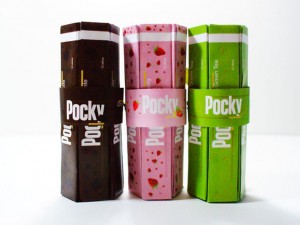
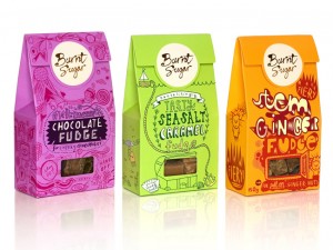
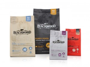
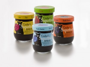
Something I’ve gotten into with package design is the idea of color and pattern and texture differentiating between multiple varieties of products within the same product line. I love it because it creates a unifying theme for all of the products in the line, while still giving each product its own personality and feel.
Also, a good thing to think about in terms of usability is using texture and pattern and lightness/darkness as a backup for color-coding, for colorblind people or black & white photographs… Or other situations where color isn’t perceivable or necessary.
I’m hoping I get to use Dr. Bronner’s Magic Soap for this project, because there’s already a color-code established. Those colors have become symbolic of what the scents are. Peppermint is blue, tea tree is orange, lavender is… lavender… Anyway, I want to play with creating textures and personalities (and even updating/tweaking the color) for those. And, as a bonus, there are similar products within that line that have completely different shapes too! Like bar soap instead of bottled, and whatnot.
Sources:
http://www.smashingmagazine.com/2008/06/02/beautiful-and-expressive-packaging-design/
http://www.packagingoftheworld.com/


