Near-Final Infographics
By Erika Goering,
Filed under: KCAI, VisCom2
Comments: Comments Off on Near-Final Infographics
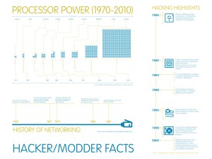
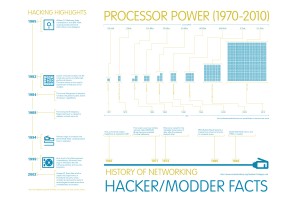
I’ve changed my electric chartreuse to a darker, gold color. It definitely helps with legibility and gives the whole system a more mature feel.
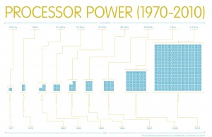
My processor infograph needed some more space, so I made it twice as wide. This allowed me to give my “processors” some breathing room.
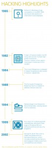
One of my timelines was just begging to be vertical, so I changed it around to give the text some more room. The information all fits in there a lot nicer now, especially since I’m using a consistent width for my blocks of text.
My first round of posters aren’t much to look at, because I was still figuring some things out (like what size my infographs should be). Now that I’ve got a better grasp on what needs to be done, I’m sure next time will be a lot better.


